Color Theory in Floral Design: Creating Harmonious Arrangements
Understanding Color Theory Basics for Floral Design
Color theory is the foundational element of any artistic endeavor, including floral design. It involves the study of how colors interact, their emotional impact, and how they can be combined harmoniously. By grasping the basics of color theory, floral designers can create arrangements that not only look good but also evoke specific feelings.
Color is the keyboard, the eyes are the harmonies, the soul is the piano with many strings.
At its core, color theory revolves around the color wheel, which showcases primary, secondary, and tertiary colors. Primary colors—red, blue, and yellow—are the building blocks for creating all other colors. Understanding the relationships between these colors helps designers make informed choices about which hues to use in their floral arrangements.
For instance, complementary colors—those opposite each other on the wheel, like red and green—create vibrant contrasts that can make a bouquet pop. On the other hand, analogous colors—those next to each other, like blue and green—provide a more serene and cohesive look. Knowing these relationships can transform an ordinary arrangement into a visually stunning masterpiece.
The Psychological Effects of Color in Floral Arrangements
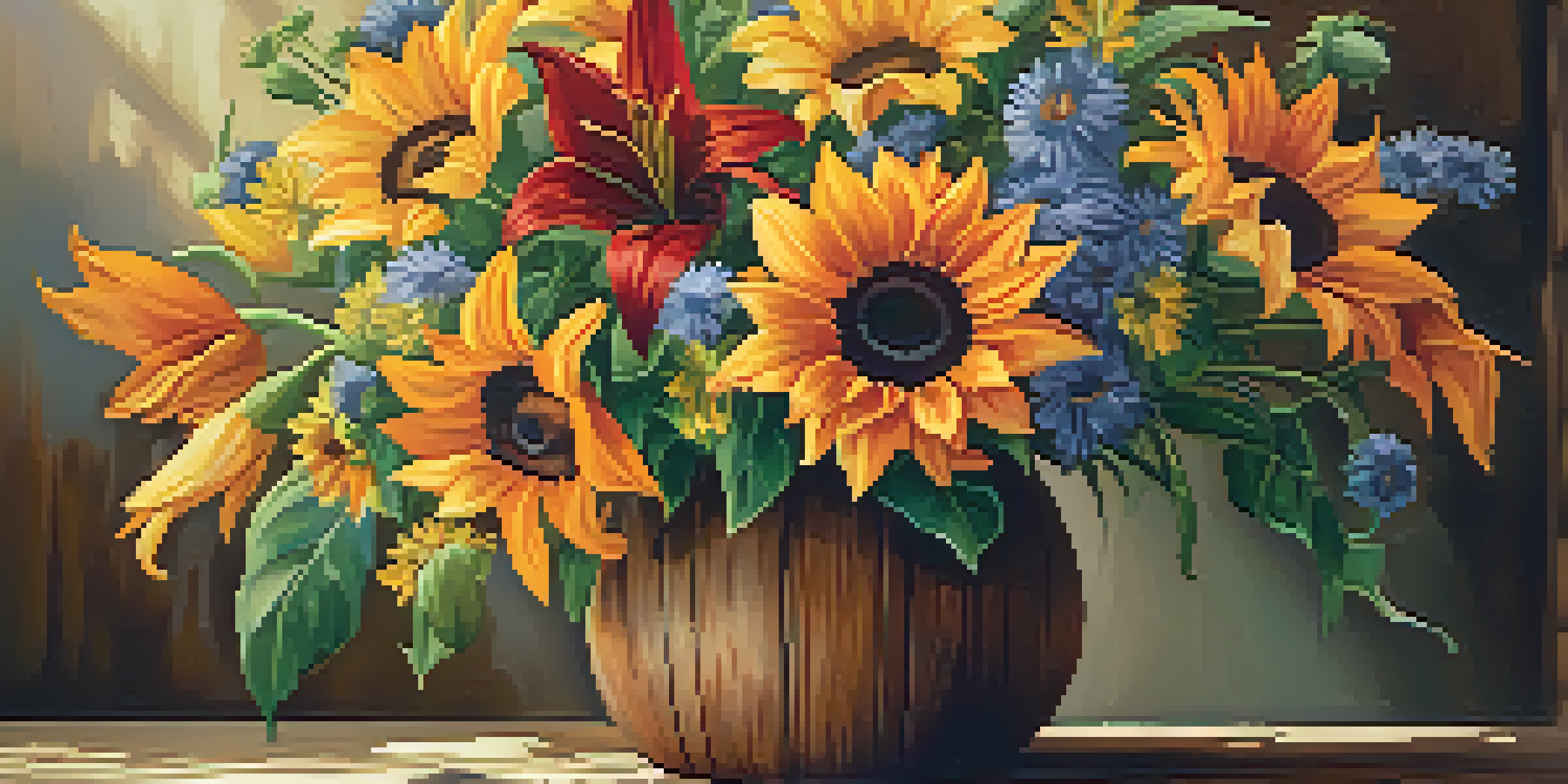
Colors can evoke emotions and set the mood, making them powerful tools in floral design. For example, warm colors like red, orange, and yellow can create feelings of warmth, happiness, and energy. This is why these colors are often used in celebrations and joyful occasions, such as weddings and birthdays.
Conversely, cooler colors like blue, purple, and green tend to have a calming effect. They are often associated with tranquility and peace, making them ideal for arrangements intended for relaxation, such as in a spa or a serene home setting. By understanding the psychological impact of colors, designers can tailor their arrangements to fit the desired atmosphere.
Color Theory Basics in Design
Understanding the color wheel and relationships between colors helps floral designers create harmonious arrangements.
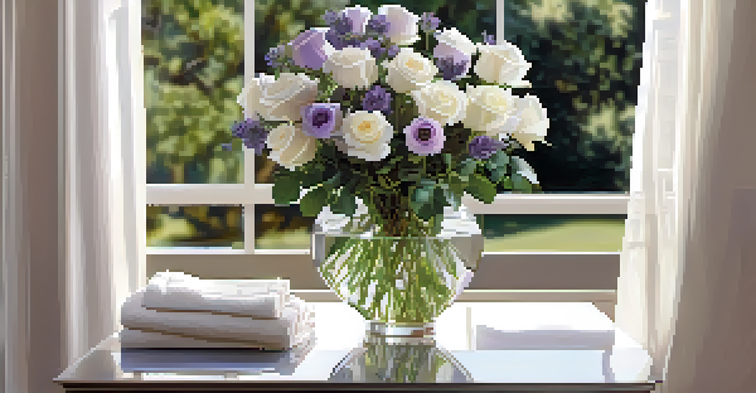
Imagine a vibrant bouquet of sunflowers and orange lilies lighting up a room versus a soothing arrangement of lavender and white roses. Each choice reflects not just aesthetic preference but also the emotional resonance that the designer wants to create. This insight allows for more intentional and meaningful floral designs.
Creating a Color Palette for Floral Arrangements
When embarking on a floral design project, creating a color palette is a crucial first step. This palette serves as a guide, helping you select colors that complement each other and align with the theme of your arrangement. A well-thought-out color palette ensures that your design feels cohesive and intentional.
Colors are the smiles of nature.
Start by choosing a dominant color—this will be the primary hue in your arrangement. From there, select a few accent colors that either complement or contrast with the dominant shade. For example, if your dominant color is a soft pink, you might choose white and green as accents to enhance the softness or introduce deeper shades like burgundy for contrast.
Utilizing tools like color wheel apps or online palette generators can simplify this process. These resources help you visualize how colors will work together, allowing for adjustments before you start arranging. This thoughtful approach to color selection can elevate your floral designs and ensure they resonate with your audience.
Using Seasonal Colors in Floral Design
Incorporating seasonal colors into your floral designs can enhance their relevance and appeal. Each season brings its own unique palette—think vibrant oranges and yellows in the fall, soft pastels in spring, and rich jewel tones in winter. By aligning your arrangements with seasonal colors, you can create designs that feel timely and connected to the natural world.
For instance, a summer bouquet might feature bright sunflowers and zinnias alongside lush greens, capturing the essence of sunny days. In contrast, a winter arrangement could include deep reds and greens, evoking the warmth of the holiday season. This seasonal approach not only adds visual interest but also tells a story through color.
Psychological Impact of Colors
Colors evoke emotions, allowing designers to tailor floral arrangements to fit specific moods and atmospheres.
Additionally, using seasonal flowers ensures that your designs are often fresher and more sustainable. When flowers are in season, they are more readily available and usually more affordable. By embracing the colors of each season, designers can create stunning arrangements that reflect the beauty of nature throughout the year.
Incorporating Texture and Shape with Color
In floral design, color isn't just about hue; it's also about how texture and shape interact with colors to create depth and interest. Different flowers and foliage can have varying textures, which can significantly influence the overall perception of color in an arrangement. For example, combining velvety roses with spiky thistles creates a dynamic visual contrast that draws the eye.
Shapes also play a crucial role in how colors are perceived. Round shapes, like peonies, may soften the overall look of a bouquet, while sharp, angular flowers can create a more modern feel. By thoughtfully combining various shapes and textures, you can enhance the impact of your color choices.
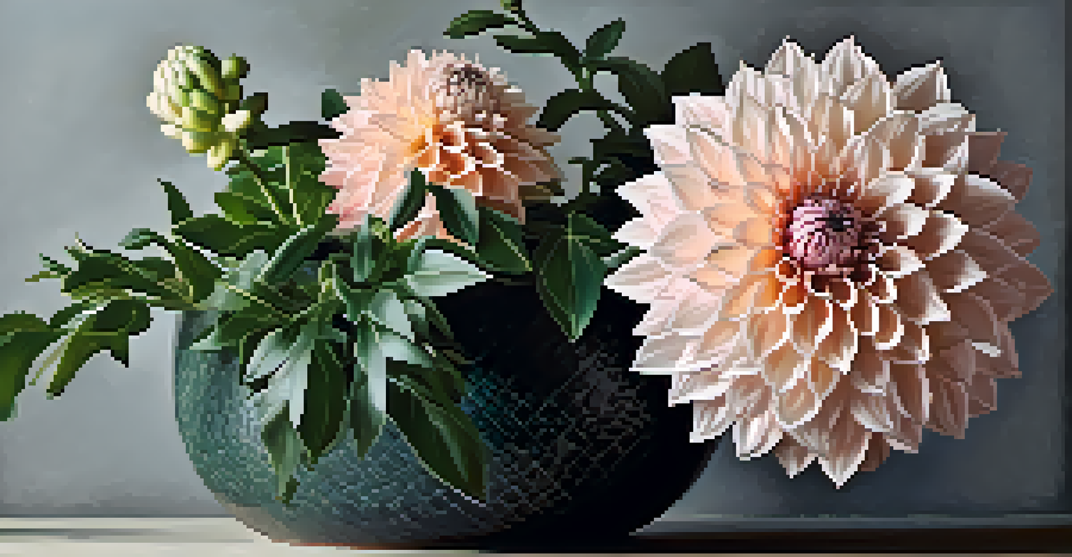
Think of it this way: a smooth, blush-colored dahlia paired with textured, dark green foliage can create a striking visual experience. This interplay of color, shape, and texture adds layers to your design, making it more engaging and memorable for anyone who views it.
The Role of Color in Floral Composition and Balance
Achieving balance in floral design is essential, and color plays a significant role in this process. A well-balanced arrangement feels harmonious and visually appealing, drawing the viewer's eye in a pleasing way. This balance can be achieved through the careful distribution of color and the use of varying shades.
For instance, if you have a predominantly warm arrangement, introducing a few cool-toned flowers can create visual balance and prevent the design from feeling overwhelmingly warm. This technique allows each color to shine while maintaining a sense of unity within the arrangement.
Creating Cohesive Color Palettes
Establishing a color palette ensures that floral designs feel intentional and visually appealing.
Consider the rule of thirds, a principle often used in photography, which can also apply to floral design. By dividing your arrangement into three sections and distributing colors accordingly, you create a more dynamic and balanced composition. This approach not only enhances the aesthetic appeal but also guides the viewer's gaze throughout the arrangement.
Practical Tips for Applying Color Theory in Floral Design
Applying color theory in floral design doesn't have to be daunting. Start by experimenting with different color combinations and arrangements in a small setting. This practice allows you to see firsthand how colors interact and how they can be used effectively in your designs.
Don’t shy away from seeking inspiration from nature, art, or even home decor. Observing how colors work in various contexts can provide valuable insights into your floral arrangements. Try taking photos of arrangements that catch your eye and analyze the colors used; this can spark new ideas for your designs.
Lastly, trust your instincts when it comes to color. While theory provides a fantastic foundation, your personal touch is what makes your designs unique. Embrace your creativity, and don’t hesitate to break the rules occasionally—sometimes the most beautiful arrangements come from unexpected color pairings.